Logo and CSS Design Work
- Client:
- Myself
- Role:
- Sole Developer
- Categories:
- CSS, Themes, and Image-Editing
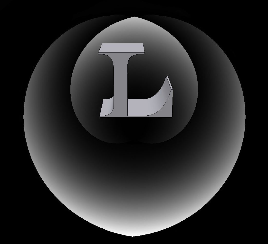
I created the logo above in the summer of 2011 after being “introduced” into the world of web development and design through Marc Aarons. It is meant to represent my most consistent state of mind (this is where locus of control comes into play). The outer “flame” represents the mask I show to the world. The inner flame represents the mask I wear to myself (I will not elaborate on that). And the L represents my true self. Psychologically, my outer “mask” has a high locus of control. The inner one has a lower (but still above average) locus of control, and my true self cannot be described as I’ve never attempted to delve that deep into my own behaviors. This can also be looked at in terms of internal and external locus of control. The outer mask interacts with the environment (the world). The inner mask’s environment is controlled by the outer mask (hence it can never “reach” the outer environment”). The true self must then contend with the inner mask, I attribute this to the rather dark nightmares I tend to have (I have grown very used to them, they no longer phase me).
At a much less psychological level, the network is called Locusnet and the site called thelocus because of the mathematical definition of locus. A locus is a collection of points which share a property. I interpreted this as a collection of like-minded individuals (the points) wanting to develop their knowledge together.
Design wise, the logo was done mostly in GIMP in the summer of 2011 to the fall of 2011. There is a great deal of very fine pixel by pixel work that went into making what it is today. Most later edits were done in Photoshop CS5 throughout the year 2012, this includes sprucing it up to fit into the theme of this site.
The logo of the site, stylized 3-D text. Not a whole lot of magic here, mostly Photoshop CS5′s ability to create 3D layers and a GREAT DEAL of time spent working pixel by pixel to make sure it looks just right. For those unaware, making small logos (especially with just letters in 3D) is very tricky business as most renders will not be able to construct something of acceptable level of detail at small resolutions.
The CSS work I did for the ACMTTU site holds a special place in my heart. Most of it was hacking together my understanding of php at the time to render a bunch of mildly dynamic pages with some fancy javascript effects, nowhere near as good as what I have going on this site or even my previous one. But it was decent.
For the ACMTTU forums , I used a rather convenient wordpress plugin called mingle-forum to get a basic forum going and set to work making it seamlessly fit in with the site. I essentially wrote my own theme for mingle-forum (its called Darker than Black) over the course of several weeks of studying CSS and sprucing it up. I also did some heavy php scripting to get around some of the features mingle forum lacks. The forums did see good use and I hope to see it being used much more in the future.
My old website was designed with a professional theme that I bought called Crea WP. I had initially spent a couple days tinkering with the Wordpress theme to see if I could mold it into what I liked and found it was suitable. Design wise, I like it more than this current site, but wordpress holds it back a great deal.
My current website leverages most of the knowledge I have gained about html, css, and js design wise up to 2013. It is not as “pretty” as my previous site, but it is very well done and has a clean design. I bought an html theme called humanum and with a great deal of time and patience, created this current site. It is a fusion of the best aspects of humanum and my Crea-WP edits.
